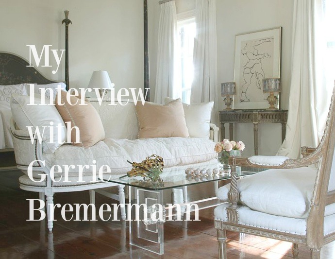
20 Swedish Style Design Tips {Decor Inspiration}
March 07, 2016
Swedish style is as relevant as ever for good reason...
find 20 glimpses of Scandinavian sensibility below.
1. (image above)
Classic elements when pared down feel modern.
(Vintage elements need not be peel-y or dusty!)

2.
Restful palettes are not always boring.
3.
Simple light fixtures.
(See: farmhouse pendants adjacent to the living room.)

4.
Light, bright kitchens.
(Stainless appliances can be a reflective friend to light.)

5.
Smart-beautiful book storage.
(A few shallow shelves and...boom.)

6.
The Unexpected can work.
(See: prickly desert treasure paired with ethereal prints.)

7.
Warm married with cool tones.
8.
Bold art that avoids assaulting the senses.

9.
Brilliant geometry!

10.
Muted rosy pinks and feminine blushes.

11.
Artful vignettes which don't feel contrived for Pinterest.

12.
Gentle, one-off approach to space limitations.
(Float books on the walls.)
13.
Unadorned wood cabinetry.

14.
Streamlined spaces can work for a crowd.
15.
A passion for a spare aesthetic.
16.
Elegance + Serenity = Sigh.

17.
Pops of warm gold with cool greys.
18.
Precisely the right pop of clutter.
19.
Folksy printed textiles.
20.
Rustic wood floors, painted or naked.
Is it any wonder so many of us are drawn
to Swedish sensibilities?
Peace to you right where you are.


10 comments
Beautiful simplicity= peaceful serenity!
ReplyDeleteyer speakin my language, kathysue!
DeleteHi Michelle,
ReplyDeleteYou're speaking my language! I'm loving that pale art mural in the kitchen, also the giant portrait. Muted colors make them so sophisticated!
xo
Holly
the giant portrait! yes!
DeleteLovely home I adore that art work in the kitchen wow!!
ReplyDeletei knowwwwwww.
DeleteI consider remodeling my bedroom and dining room. Here I found some really helpful tips and inspiration. Thanks!
ReplyDeleteyay, bethany! you go!
DeleteI don't know how I missed this :\ I'm all about this approach to design Michele. Love the dusty rose, pops of cold, smart storage, simple lighting, and clean lines. I also like those fun printed textiles at the bottom and the unexpected artwork. Great post!
ReplyDeleteReally nice post! You are such an inspiration to all of us!
ReplyDelete:)
Your comments add to the beauty...thanks in advance for your kindness.