Hello Lovely Fixer Upper {Kitchen Reveal}
March 23, 2017 |
| Serene and Simple Modern Farmhouse Kitchen - Hello Lovely Studio |
Welcome to our DIY renovated
modern farmhouse style kitchen!
I have shared glimpses here and there of the
kitchen at the Chicagoland fixer upper, but this
post will roll out some of the resources and
reflect upon how far the kitchen has come.
If you're new to the blog,
we're wrapping up a whole house
DIY reno, and we're half out
of our minds since we work full-time
in fields unrelated to construction.
Yes, m'am, things move at a pace
around here we'll call
L O V E L Y T I M E.
 |
| Serene White Kitchen with Modern Farmhouse Style |
In the end, we turned the space into a
modern farmhouse style kitchen
with a slightly European feel.
Here's how we made that happen.
It would have been swell to open the kitchen
to the adjoining dining room, but
that turned out to be too tricky so
we kept the cozy size
and re-designed the layout by
moving the frig, range, microwave,
dishwasher, peninsula...oh yeah,
by moving everything.
Below is how it looked when we
bought it...20 year old
vinyl cabinets, newer laminate
counters, and maple hardwoods
which looked pretty but were
ruined from water damage.
We salvaged all of this and moved
it down to create a basement workshop.
Demo is always a relief,
and after the area was gutted, we met with
kitchen designers and gathered our ideas.
As much as an island would be great,
it felt awkward wherever we taped it out.
I couldn't imagine working at it because
I would be oriented to the long
hallway and not the outdoors,
so I opted for a peninsula/bar
as before but pushed it out further,
stealing a foot from the breakfast area.
 |
| It was at this stage that I plastered the ceiling...yep, I became a mudder. |
recessed lights, and electrical outlets
to prepare for the new design.
What a happy day when the
white oak hardwood flooring went in!
Now we have more space in the working
area of the kitchen, and we may eventually
add a small island in the center,
but since I'm kind of a freak
about visual clutter, it's best
to take our time.
There are white custom Shaker style cabinets
from floor to ceiling on the frig wall
and no other upper cabinets.
Cabinet hardware pulls are the simplest
stainless modern ones I could find.
The dishwasher is hiding behind a panel
to the right of the sink.
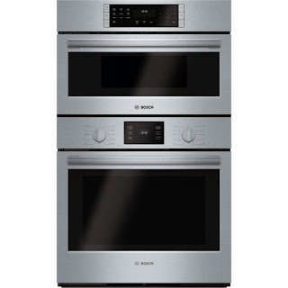
Bosch stainless appliances,
a wall of polished subway marble tile,
a fireclay farm sink,
a bridge faucet,
a beverage frig,
new drywall,
beadboard on the bar and an accent wall,
and new Shaker style window trim
round out the plan...and what am I forgetting???
The quartz countertops!
The color choice was more challenging
than I prepared for, but I'm so happy
with the Minuet (LG Viatera) which
Minuet is an alabaster
white with light grey veining
that works beautifully with the
natural polished marble wall.
We used white grout on the tiled wall
which quiets the marble, and you may
recall these tiles are dear to me since our
Bella pitterpattered over each and every
one when they were laid out on the floor
just a couple of days before she got her wings.
It's a small humble kitchen, yet we managed to
fit lots of lovely useful things in here!
 |
| Hello Lovely Studio - Kitchen Reveal |
I'll be sharing more with you in another post
about secrets of downsizing, and I don't mean
secrets of the variety "here's how to do it perfectly,"
but rather the realistic challenges you should be prepared
to encounter and some of the pitfalls you may
not have considered...adjusting to a much smaller
kitchen is harder than I imagined it would be.
 |
| Hello Lovely Studio - Kitchen Reveal |
 |
| Serene and Simple Modern Farmhouse Kitchen - Hello Lovely Studio |
 |
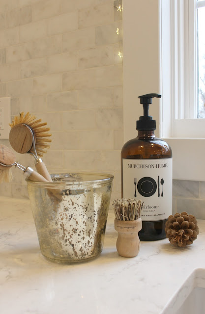
| Murchison Hume Must Haves |
 |
| Viatera Minuet quartz countertop, Bosch appliances |
 |
| Countertop: LG Hausys Viatera Quartz in Minuet |
 |
| Hello Lovely Fixer Upper - Kitchen DURING |
 |
| Hello Lovely Fixer Upper - Kitchen DURING |
 |
| Hello Lovely Fixer Upper - Kitchen DURING |
 |
| Hello Lovely Studio - Kitchen Reveal |
 |
| Hello Lovely Studio - Window Seat in the Kitchen |
 |
| Hello Lovely Studio - Chicagoland Fixer Upper Kitchen Reveal |
Below are most of the resources for this kitchen:
Stainless Range Hood

30" Bosch 800 Stainless Gas Cooktop
Bosch 36" Counter-depth French Door Refrigerator
(ours is a model with just one drawer)
PAINT COLOR:
Benjamin Moore "White"
Yep. Just plain White with no word before or after it.
I used it throughout the whole house and for trim.
This is a pure bright white I needed to offset the
yellow cast of the light here which seemed to compromise
every other white I tried...even whites I have used in
the past which were cool, looked yellow here.
I may not be able to work a simple jigsaw puzzle
or know how to turn on a television, but this girl
can pick paint colors...cocky, yes, but I have been
doing it for other people forever and am confident
with my artist's eye.
So I created a graphic cheat sheet for white and grey
paint colors which have worked well in our homes.
Please pin it and let me know your opinion!
We used Ashley Gray in several rooms at our prior home.
Revere Pewter is what I used to glaze our bedroom
furniture, and Classic Gray is what I'm leaning
toward for the laundry room.
 |
| Hello Lovely Studio - Kitchen Reveal |
scaled better for the kitchen than our huge
harvest table, but these things take time,
and I have learned to be patient.
 |
| Hello Lovely Studio - Kitchen Reveal |
 |
| Hello Lovely Studio - Kitchen Reveal |
 |
| Hello Lovely Studio - Kitchen Reveal |
 |
| The large painting is by Melissa James, and the smaller ones are by me |
Thanks for touring our DIY kitchen reno progress,
and stay tuned for reveals of more rooms very soon.
If you missed the master bedroom reveal, you'll find it here.
The master bathroom reveal is right here.
Peace to you right where you are.


8 comments
Your Kitchen is beautiful, and I love the airy feeling in its grandeur....
ReplyDeleteI also noticed you made a video.... I had to lol, a big smile because it was fab girl....Michele,
I love your take off of VOGUE 73 questions....
Your quick punchy answers were as if you were interview by vogue themselves.
Your home is sensational...
Xoxo
Dore
Thanks for the love, French Cali girl--I am totally ready for Vogue just as soon as I learn to dress and check the mirror for how the back of my hair appears...ha! xox
DeleteIt turned out awesome! You have transformed this house. Serene. The shutters from the bathroom are something I would love to try but not sure I could get the measuring all squared up! We are in the middle of updating our kitchen right now (we built our house 15 years ago, so we are ready for an enhancement-painting the cabinets, new granite countertops, bluestar custom color stove - that was fun selecting color/knobs! and new hardware) super inspirational, love the color for your laundry room...and whites are interesting to select...Benjamin Moore incredible white is what I am probably doing on the cabinets...enjoying your blog so much
ReplyDeleteThanks, Elaine! I was so nervous about the shutter measuring and ordering online but Barb at Riverwood Shutters made it a snap with emailing me exactly what she needed. When you have a real live person holding your hand AND building the product hen you are home free. Your project sounds gorgeous!!!
DeleteWOW! It looks beautiful!! You should be so happy! LOVE!
ReplyDeleteThank you, Leslie. With the construction done, I am now focused on details to make it personal and pretty...it has taken soooo long to get here with doing it ourselves...never again...probably. Ha!
DeleteMichele it is simple, understated, elegance in it's best form. So peaceful and serene, bright, fresh, airy. All the buzz words I love in describing a space. Great job and design!! Kudos to you and hubby!!
ReplyDeletethanks, kathysue. i'm humbled by your words.
DeleteYour comments add to the beauty...thanks in advance for your kindness.