Hello Lovely Fixer Upper {Master Bath Reveal}
March 19, 2017 |
| Hello Lovely Studio - Master Bath Reveal |
The master bath renovation here at our Chicagoland fixer upper
took a good chunk of time since, like the rest of this place,
it was truly a DIY project.
(And by "us" I do mean my husband,
who with brains and brawn...totally pwned
(I know, I know...2008 wants its slang back)
and deconstructed this space
down to its studs to create a new
bathroom which functions beautifully.)
You can see the finished bathroom in the
fixer upper reveal video where I show you
around or the shorter montage one here.
 |
| Pacific Entries knotty alder rustic door |
BTW.
Real life renovation requires
serious delay of gratification.
Serious.
The only time available to renovate this place
involved weeknights after work and weekends...
I share this because I have a tendency to
make things look easier than they are.
It never benefits him or me to do that.
Just to recap: we have no
Property Brothers, no cleanup crew,
no private chef, no grove of money trees,
and certainly no chance for peerless since
we lead real lives as an attorney and a writer.
I am so grateful for the talents and work ethic
my husband brings to all his endeavors!
On with the master bath show.
 |
| Hello Lovely Studio - AFTER |
Some history:
When folks hear the term "fixer upper," I think
they often think of homes with tiny cramped
rooms crying to be opened and united.
That's not always the case.
Sometimes the problem is not lack of space,
but rather how the square footage is utilized.
We were fortunate the master bathroom
was a nice size, but if you followed our
reno adventures, you may recall it was
configured as one room, without privacy
for the WC or the shower
(you fit pi/yo moms can keep your
glass shower walls, thank you very much).
I liked the footprint we had to work with
and also the sloping roof lines which
give this bath architectural interest.
 |
| That's good bath-side reading. |
given that my blog is so Pinterest friendly...
I didn't have a particular inspiration bath I was emulating.
I'm frugal. It doesn't make sense with this fixer to
become too invested in a final 'vision' for a room...
instead, as I have done for all the spaces here,
I start with function and keep design plans
very flexible and loose.
I let the spaces whisper what they want to become
and make friends with quirky design imperfections
too costly to change.
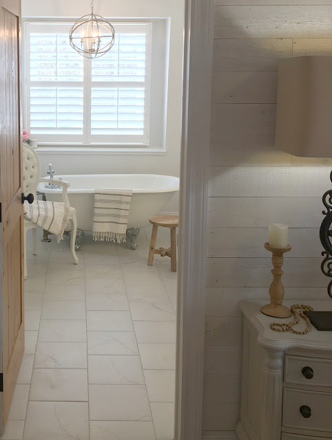 |
| Hello Lovely Studio - AFTER |
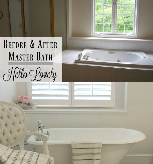
an awkward pedestal sink
a wornout vanity
vinyl floor covering
a black toilet
a brass and glass shower
a jetted tub and its Jupiter-sized platform
Madonna cone bra vanity lights
a small linen closet by the WC
white spray painted faucets and fixures
a hollow door which opened into the vanity
We wanted to gain:
a larger shower
a private WC
two sinks with separate vanities
high quality fixtures
a freestanding tub
smooth walls
a tile floor
a new door
To begin...we demo'd everything, breaking apart the
ceramic tiled tub platform, tearing off all the
drywall, and ripping out every fixture
to begin fresh.
Here's what we incorporated:
Kohler Purist sink and shower fixtures
Vintage clawfoot tub
Martha Stewart sconces
Marble topped vanities
Herringbone marble shower floor
Porcelain tile shower and flooring
Antiqued silver sphere chandelier
Riverwood plantation shutters
Pacific Entries knotty alder door & hardware
Benjamin Moore "White" paint
 |
| Hello Lovely Studio - AFTER |
Gutting the bath from top to bottom
Discovering lots of water damage and then
remedying all of it with new subfloor and walls
Constructing a new wall to provide privacy to the WC
Moving the WC to make way for a larger shower
Plumbing the new shower, tub, and double sinks
Updating all the electrical
Installing a new ceiling
Adding baseboard and trim
Adding a new door
Tiling the floor and shower
and
a million other things,
all of which were done by my man...
the incredible human who carries out
all the stuff I dream up for this place.
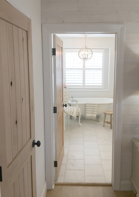 |
| Pacific Entries knotty alder rustic wood doors |
(airy because the excessive tub platform
was replaced with a petite vintage clawfoot tub).
Let me show you.
 |
| Hello Lovely Studio - Master Bath Reveal |
We found the tub on Craigslist many months
before it was able to rest in its new home!
The custom plantation shutters make all the difference
in the world since we can now allow abundant
natural light to stream in, while still preserving privacy.
We found the vintage leaded glass window years ago
and hung on to it for just the right project...here it
allows the shower to have natural light without
being a peekaboo window.
On the inside of the shower, a deep niche
shelf holds all my products at a sensible
height for a fairy...SCORE.
 |
| Hello Lovely Studio - Pacific Entries knotty alder wood door |
The floor tile is porcelain from Lowe's called
Calacatta, installed in a staggered pattern.
My mom gave me the light fixture for my birthday
a few years ago, knowing I would find a place for it.
 |
| Hello Lovely Studio |
See what I mean about the wonderful light the bath receives?
Here's a markup I shared awhile back:
 |
| Hello Lovely Studio - BEFORE |
wired directly on the mirror so we kept it.
 |
| Hello Lovely Studio - AFTER |
classic design...I think the lever handles are more popular
than these cross handles.
The painting is an abstract I painted on a board.
 |
| Hello Lovely Studio - AFTER |
and my products peeking through (#stylistproblems).
 |
| Hello Lovely Studio - AFTER |
I painted with Benjamin Moore's Classic Gray.
The abstract painting above it is one of the first
I ever created...it's on wood.
 |
| Hello Lovely Studio - BEFORE |
To make the cheap and worn brass fixtures look new for
marketing pictures to sell this foreclosure,
all of them were spray painted white!
 |
| Hello Lovely Studio - DURING |
in order to accommodate a larger shower
on the left hand side.
 |
| Hello Lovely Studio - DURING |
and in came the petite proportioned tub.
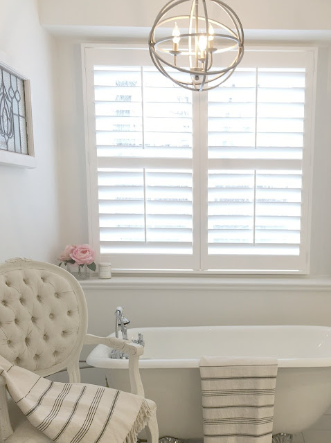 |
| Hello Lovely Studio - AFTER |
and I always find a place for her.
 |
| Hello Lovely Studio - AFTER |
| I thought I might paint the side of the tub or the feet, but once it was in place I liked it as is. 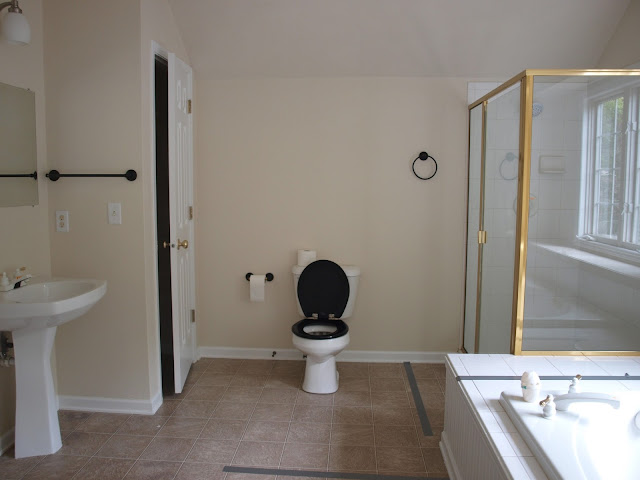 |
| Hello Lovely Studio - BEFORE |
and I was mighty worried that we would miss
having one, but things are fine without it.
I store sheets in the drawers in my closet,
and the towels are plopped down on a
bench or chair where we can see them.
 |
| Hello Lovely Studio - Shower - DURING |
 |
| Hello Lovely Studio - AFTER |
 |
 |
 |
| Hello Lovely Studio - AFTER |
I used another Ikea Molger bench near the WC and left
this one unpainted for some warmth.
 |
| Hello Lovely Studio - AFTER |
I painted the inside of the knotty alder door white...
the bedroom side of the door was left natural like
the rest of the wood doors in the house.

 |
| Hello Lovely Studio - AFTER |
 |
| Hello Lovely Studio - BEFORE |
 |
| Hello Lovely Studio - DURING |
 |
| Hello Lovely Studio - DURING |
 |
| Hello Lovely Studio - AFTER |
 |
| Hello Lovely Studio - DURING |
This is the opening that the vintage leaded glass window covers now. |
| Hello Lovely Studio - AFTER |
 |
| Hello Lovely Studio - AFTER |
 |
| Hello Lovely Studio - AFTER |
 |
| Pin This Project |
So this is how it looks today, and I'm just now
at the stage where I am adding finishing touches
and finally addressing issues like caulking
baseboards and paint touch-ups!
Let me know if you have any questions
about the project...I'll be following up soon with
resources for the whole fixer upper project.
Peace to you right where you are.




18 comments
Your bathroom looks beautiful. Such smart use of space.
ReplyDeleteThanks, Robin. It was a challenge trying to get photos to show the space!
DeleteAbsolutely beautiful!!! Well done Michele! xo
ReplyDeleteThanks so much, Greet. xox
DeleteStanding ovation to you and your Husband...stunning design and fixtures! I truly admire your team DIY skills and the result is over the top gorgeous.
ReplyDeleteIt's all him for sure! merci, friend. xox
DeleteHi Michele, It's beautiful! Love everything about it, I just can't understand why you'd want to get rid of that lovely black toilet 🙂
ReplyDeletehahaha and that was the least of our worries! just the weirdest combination of leaks, doors opening the wrong direction, light switches located in another room and on and on! history! :)
Delete....sanctuary..... It was worth it right? xo
ReplyDeletedefinitely. :)
Deletelooks totally gucci! (hows that for a throwback!) i have to get the shutters...
ReplyDeleteyou're fun! i can't say enough good things about the shutters...my first plantation shutters! xox
DeleteHi michele! You really did a beautiful job! I love how bright & fresh everything looks. great job.
ReplyDeletethanks so much...and thanks for stopping! xox
DeleteIt is stunning! Clean, fresh and classic! Love!
ReplyDeletewhat a relief when the renovation exceeds your expectations! thanks. :)
DeleteAbsolutely stunning! Beautiful job,and you will enjoy it! congrats!
ReplyDeleteawwww shucks, thanks for the kind words. :)
DeleteYour comments add to the beauty...thanks in advance for your kindness.